Case name
DesignSystem(s)
Long Story short
Design Across Disciplines
Our goal for the project was to work agile and efficient in a cross functional team.
A Design System offers structure, standards and build-in visual consistency by providing a way of working across disciplines, where design plays more the role of a facilitator. It promotes best practices in achieving the best user experience while working together.
My Role
Strategy
Planning
Design + Execution
Support
Year
2019 — 2021
I led the efforts in the creation of multiple design systems, from strategizing and planning to execution, for 3 brands (Raleigh, Lapierre, Haibike). In addition, I worked alongside a UX lead researcher, junior designer, content editors and strategists, brand managers, SEO specialists, developers and a product owner.
Daily operations included working agile in 2 weeks sprints.
Disciplines Involved (A-Z)
Branding — Content — Design — Development — SEO
The Challenge
We had one primary objective — to deliver a headless eCommerce platform to serve the entire portfolio of brands. Raleigh was chosen to be first to test the concept.
Our small team was under extreme pressure to move fast. We were tasked to deliver an entire new platform, build from scratch, within 4 months.
The combination of a fixed deadline, and the capacity within the design team meant I needed to get the Design System going all by myself. Prioritization was key to delivering on time.
Design
for Teams
Join the Party
Design Systems bring clarity in multi-disciplinary teams. This means more time to be productive.User story
As a designer / developer / content editor / marketeer / agency
I want to quickly have access to the Visual Language / UI Components, Object Components, Patterns, Resources and Guidelines
So that I know which rules to apply in order to design / build / create while keeping consistency for the brand and stay true to its archetype.
What
The Design System — a systematic approach to design. It is a definition of elements such as typography, colors, UI components, codes and guidelines that we use repeatedly and consistently to build our websites and products across channels and mediums. It provides a better way of working.
Why
Inconsistency in user experience across digital products can cause a decrease in learnability and confusion.
A Design System brings order and consistency to our digital products. They help to protect our brand, improve user experience and time to market and brings efficiency of how we design and build products.
It is a source of truth and a system of record for our design decisions.
It holds us to high standards, keep teams on the same page, and help to onboard new team members.
It documents the why, when, where, and how.
Who
The design system is relevant for everyone in the creative and development space, such as:
- Designers
- Developers & Engineers
- Marketeers
- Content editors
- Creative agencies
Clear Benefits
- Design & develop in a more structured way
- Focus on solving real user problem instead of preventing or researching inconsistencies
- Faster development process, better code & quality and ensures scalability
In combination with the right audiences, it can promote a company wide design mentality which is useful not just for the creation of product design but can also influence the process of creating and marketing a product.
Separated teams: brand, marketing, product, development should be included as much as possible to ensure that everyone is working toward a unified brand and product.
Lack of
Consitency
Clarity
Achieving consistency is a milestone, but Design Systems should aim for coherence. Consistency aims for making elements uniform. Coherence aims for clarity.Start with Intent
The design team had a solid background in building and optimizing web based platforms and one of the most common issues agreed upon was inconsistency regarding visual representations of the same elements in user interfaces of digital products.
Customer
Inconsistency results in difficulty for user to (learn how to) navigate any digital product, thus there is a risk of decrease of trust in the company behind the digital product.
Content Editor
In a traditional approach the content is designed and saved in pages within the CMS. This results in content not being re-usable across channels. Therefore content editors have to entry the same content repeatedly.
Design — Development
There is a gap between the way developers think & develop and the way designers think and design. A design system solves this issue by providing an ecosystem of objects components that relate to each other, by enforcing a single source of truth.
The OOUX
The Solution
Team OOUX
"Align, co-create, and reduce rework with Object-Oriented UX (OOUX) — Sophia V. Prater. Within our team it was introduced, promoted and evangelized by Kamil, our UX Lead.
Object Oriented UX
As opposite to visualization of pages in images, which can lead to slow development and inconsistency of the end result versus the initial design the Object Oriented UX (OOUX) is a solution to end frustration for both designers and developers. OOUX is a framework and a way of thinking that supports researching, designing, developing and maintaining a digital product.
This is the way
Components first.
Content first.
Mobile first.
1 st
By working object-oriented we ensure that:
- we keep simplicity and reduce complexity as we do not introduce unnecessary new design elements
- we are able to easily improve our UX by iterating on our existing objects without impacting the rest or creating clutter
- most important: build brands using existing objects and iterating on them by adapting the styling of the objects to the brand identity
The concept of OOUX has been translated to our design system by using Object Components. You could see them as Lego bricks (objects) we use to build up user interfaces.
OOUX
Understand and design the system objects
CTA Inventory
Decide the actions on objects
Interaction
Design how users take actions
System of Objects
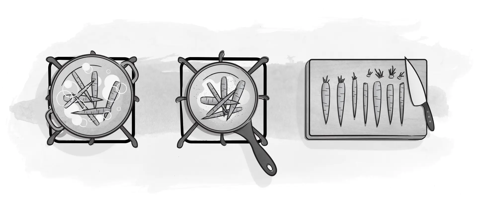
Below a very basic example on how we started brainstorming for objects. Objects can be extracted from product goals. To each object we defined elements such as core content, and nested objects. As a final step we prioritize the elements and associate actions.

Product Object
in our Design System
The core products of the each brand's offering. We use this for bikes, equipment, parts.
Small


Medium


Large


Full


Clear & basic
The Structure
The design system follows the Object Oriented (OOUX) approach. To reduce friction during collaboration, components are semanticaly named based on known terms within our team.
- Overview — an introduction to our choice for Object Oriented UX, the brand, editorial and visual guidelines
- Visual Language — helps us distinguish between every element and every experience designed by / for Lapierre and helps the brand to differentiate from its competitors.
- UI Components — key building blocks, each component was design to solve a specific UI problem and work harmoniously together.
- Object Components — For all our brands we apply the principles of OOUX. It is a framework in which we think about core content and data as objects instead of artifacts we would normally use such as pages.
- Patterns — best practice solutions for how a user achieves a goal. They show reusable combinations of components, objects and templates that address common user objectives with sequences and flows.
- Guidelines — What you need to get started with designing and developing, libraries and assets.


Science Club meets Art Club
Play by the Same Rules
Design systems exist to handle and encourage change. However this can only happen if everyone plays by the same rules based on collaboration and partnership. The challenge of design systems is to find the balance between scalability and creative freedom.
Summary of achievements
- opened the Design system for feedback and input from all disciplines and as a result components perform better.
- I've invested time in labeling everything precisely. A designer or a developer can quickly understand and locate what they’re looking for, solely by the name. The Object Oriented UX approach from the design system and naming conventions are followed across disciplines.
- I've designed flexible building blocks right at your fingertips. Implementing a new module with a heading, body copy and a call-to-action(CTA) is as easy as grabbing those components from the design system.
- Everything was designed to be component based so that commonly paired elements can be fully assembled in sections using the same basic elements from our design system.
Lesson learned
Happy Flow
Unfortunately we had to leave out the most-wanted feature, the connection between Sketch and Storybook. This is a must-do to ensure the components are always in sync. The source-of-truth needs to stay up-to-date across tools. By not evangelizing the importance of this connection within your organization you’ll greatly increase time spent on maintenance.
During development there's a process loop of ideation where Sketch components can loose their status of "truth".
Scaling
for multi-brand
Design to scale
Keeping Up with Demands
While the design system offers the same set of components, to expand it across multiple brands requires the use of:
- Design tokens — global and brand specific. These can represent anything defined by design: a color as a RGB value, an opacity as a number, an animation ease as Bezier coordinates.
- Brand configuration system — One code different results. Design Tokens take care of the styling but there are situations when layout needed to be handled differently and accordingly to a brand needs.
- Layout changes — sport vs. lifestyle brands
- Object Components — specific content
- Payment methods — localization specific
- Distribution — dealers, click & collect
- eCommerce — only certain brands, at times even only certain countries wanted to sell online
- Theming — light/dark mode
Theming
The brand configuration system acts like a switch by changing the values within the design token.


Win Win
Design System
In conclusion
Design Systems are like ecosystems — they thrive within an environment where teams from all involved disciplines work together to form great user experiences. Building one is fairly easy to begin with. Start with the most basic of design principles and all the rules that come with the best practices will follow. It can expand pretty quickly to create an entire new world set by rules of guidance and usage, but always remember and never forget that the devil is in the details.
WIN for Customer
The experience of a more consistent UI, thus making it easier to learn, navigate, find and complete a task, be it either to find information or make a purchase.
WIN for Team(s)
Easier and faster to design, develop and maintain while keeping consistency. This helps business on focusing on actual problem solving for customers and as a result yield better comercial results as well as lower costs.
The End
Deliverables
- Report on concept and structure in Atlassian Confluence (how to get things started)
- Atlassian JIRA Roadmap
- UI Library in Sketch
- Documentation
- Code (for UI Components)
- Assets
- Design Tokens
- Prototyping
- Zeroheight for Raleigh & Lapierre
Personal Note
When designing components in your tool of choice, be it Sketch or Figma, it's important to consider how other designers operate, utilize and want their component to behave. This responsibility expands when working with developers. Components need to be properly named, thus friction is reduced during collaboration.
While design systems need to be documented, they also need to allow enough flexibility so that designers don’t feel that their creativity is hindered.
In hindsight I should have promoted the Design System more.
Out there
View LapierreView RaleighUX and EyeCandy.
© All rights reserved. Images belong to the brands.