Case name
Bose — Soundis power
Long Story short
Setting the foundations for an immersive experience
LEAP is the codename we've adopted to describe our new platform, featuring a revamped design and a modernized tech stack. This transition involved migrating from Adobe Experience Manager (AEM) to Salesforce.
As a team, we were trying to create a shared UX mindset within the teams we are working with. It was a process that required education, patience and a lot of repetition.
My Role
Design Systems
UX Strategy
Planning
Design + Execution
Dev Support
Year
2021 — 2024
My contribution
1. Design Systems — I led and guided the creation of foundational elements for design systems, facilitating consistent and scalable design solutions. Additionally, I produced critical documentation to align design and development teams. Ensuring the quality of new implementations, I held demo sessions, conducted thorough reviews, and promptly addressed critical issues through effective escalation channels.2. Immersive brand stories — I played a key role in guiding and collaborating with the CX optimization team, leading the development of a customer-centric information architecture for explore and flagship pages. Our strategy focused on leveraging immersive experiences driven by a passion for sound, aiming to build lasting customer relationships. Educating the user on the product’s possibilities and its usage through storytelling. Convince the user that the product is the right one for them as well as propose similar products that respond to their needs.
Disciplines Involved (A-Z)
Marketing — Content — Design — Development — CRO — SEO
The Challenge
We faced the challenge of bringing the brand to life in digital while considering business needs. The approach involved a blend of experiences, services and commerce that serves our user’s needs and connects with them on an emotional level. Our current platform faced several recurring issues that affected the user experience:
- Inconsistent design — Appearance and user experience vary widely across pages.
- Perceived limitations — The platform is seen as a constraint, not an enabler.
- Lack of visibility — Teams are unaware of what can be achieved within the system.
- Rigid platform — Making organic and holistic updates is difficult.
Our goals
The UX team ambition was to create a connected, branded, ecosystem at scale:- Develop a deep understanding of our users and how they interact with the brand
- Solving customer pain points and offer moments of delights
- Provide short term value to the business that align with the long term vision
Solid Foundations
Design System
User story
As a brand
I want to establish a solid foundation within our design system
So that we can maintain a consistent brand identity across all digital platforms and enhance customer recognition and loyalty.
Setting ourselves up for success
Our objective was to encourage both our internal teams, external vendors and agencies, to adopt and work within the boundaries of a design system. Recognizing that resistance to adopting new systems is common, we concentrated on establishing solid foundations that could adapt to our rapidly evolving business and increasingly diverse user base.
We need a cross-functional team
We need established rituals
We need accesible documentation
The design system had to empower us to gain a competitive advantage through user-centric design, enabling the creation of a transformative digital experience at scale.
Our goals
A single source of truth
Our high level goals were to centralize our understanding of the design system to make it easier to understand and use:
- Make it fast and easy to use for everyone, everywhere.
- Create a platform for innovation and deeper engagement.
- More consistency and more clarity
Identifying challenges
Our Figma library, rich with comments, served as a decision log to pinpoint recurring issues encountered by teams. As daily demands surged and requests multiplied, we faced the challenge of maintaining consistency across two distinct platforms.
#1 Inconsistency
An initial audit of the design system components revealed misalignments among team members regarding changes and new proposals, highlighting the need to refine our processes and establish clear governance.

#2 Lack of documentation
While addressing development changes and resolving issues, we discovered a significant disconnect between design, front-end, and authoring teams. Each team referred to different files in search of the source of truth, leading to confusion and inconsistency due to some unmaintained files and components.
#3 No governance
When there is no governance over a design system, several challenges can arise, often leading to inefficiency and inconsistency across an organization's projects.
- Inconsistency
- Redundancy
- Quality issues
- Scalability problems
- Adoption Barries
- Decreased collaboration
Design System
is a Product
Design System
Learnings
A design system is a transformative way of working, a scalable resource, and the ultimate source of truth. Adopting such systems represents a significant cultural shift, and any resistance to this change must be thoughtfully addressed and managed.
A way of working
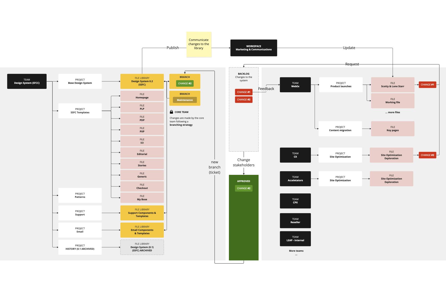
I’ve established a structured approach by organizing Figma files according to team roles:
- Library (The Source of Truth) — houses all in use design elements and components.
- Template (Library in Use) — utilizes the library within specific guidelines.
- Working Files (Design Freedom) — flexibility in using and adapting the design system.
Summary of achievements
- Guidelines and recommendations — I led the creation of guidelines and recommendations to support our creative teams.
- Design system and CMS integration — guided the team to bridge the gap between the CMS and the design system library to facilitate collaboration between authoring and design.
- Naming conventions — Standardized and refined naming conventions, resolving inconsistencies to boost the reusability of our assets.
- Component Optimization — I’ve led the efforts to provide structure and better performance of the components in Figma and in development in order to ensure the platform is scalable.
- Quality assurance — Held demo sessions, conducted in-depth reviews, and addressed critical issues through effective escalation channels.
Highlight
Card System
Before → Desktop first

Issues with visual hierarchy made it difficult for users to quickly skim through information. Furthermore, the entire card not being clickable contributed to a high bounce rate and low click-through rates.
After → Mobile first
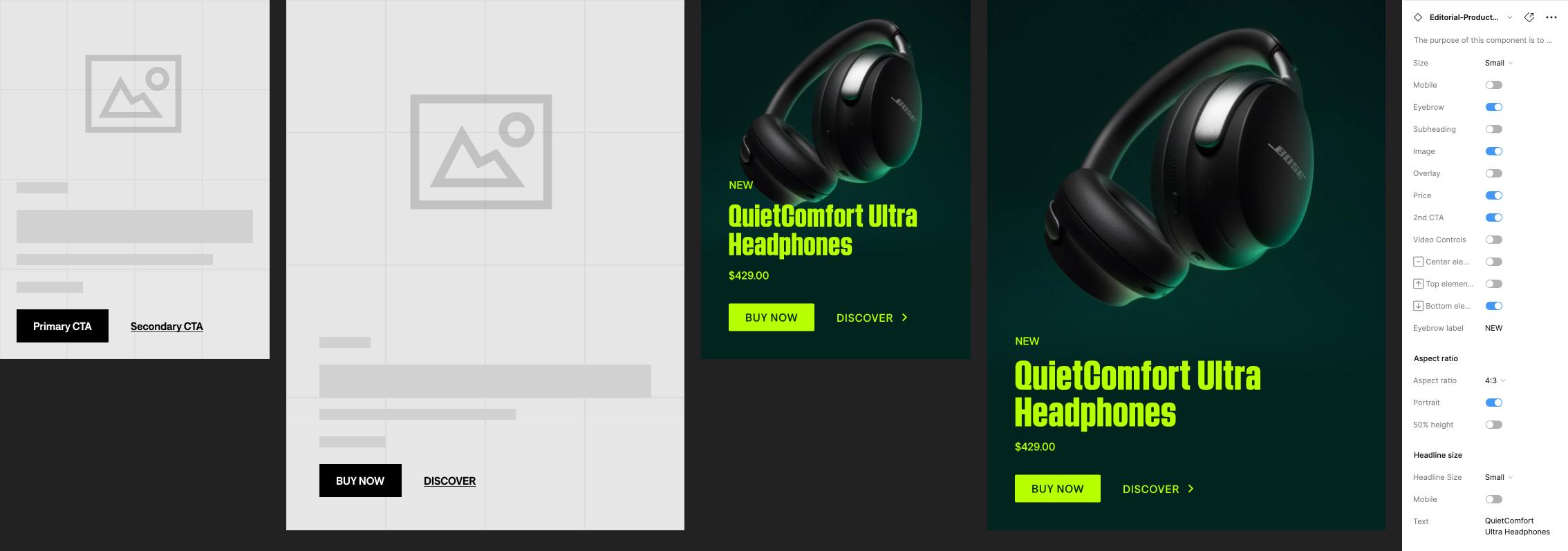
We improved the customer experience by implementing internal guidelines and recommendations, ensuring alignment between Figma and our CMS with consistent, configurable options.
A mobile-first experience should never feel like a compromise
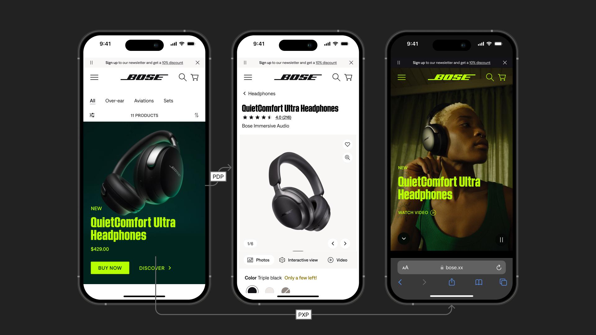
To accommodate the fact that approximately 80% of our web traffic comes from mobile devices, it became imperative to adopt a mobile-first approach that transcends the notion of compromise. We aimed to move beyond a "good enough" mentality by integrating visual hierarchy and robust design system rules. This new strategy allows us to craft instantly impactful and deserving designs optimized for the mobile experience.
Connecting the dots
Our cards, spread across diverse templates, offer customers seamless access to information. Yet, working on different projects can cause a disconnect between these components. To counter this, we stressed that each card is part of a bigger picture, focusing on consistency and familiarity to maintain a coherent user experience.
Additionally, we equipped visual designers with multiple stylization options for cards, allowing the use of any feature artwork while also supporting content with landscape imagery or without any artwork, enhancing versatility across content types.
Guidelines & recommedations
We've developed documentation to help cross-functional teams fully understand the system, enabling them to produce their best work within established limitations.
Immersive Brand
Stories
User story
As a music lover
I want to use interactive and educational tools to explore and understand sound
So that I can find products that meet my specific sound needs and enhance my listening experience.
UX Strategy
Desire must precede purchase
Our UX Strategy approach aligned with established business goals, focusing on illustrating the power of sound by creating immersive experiences that encourage exploration, not just shopping, prioritizing the consumer's overall sound experience over mere transactions.
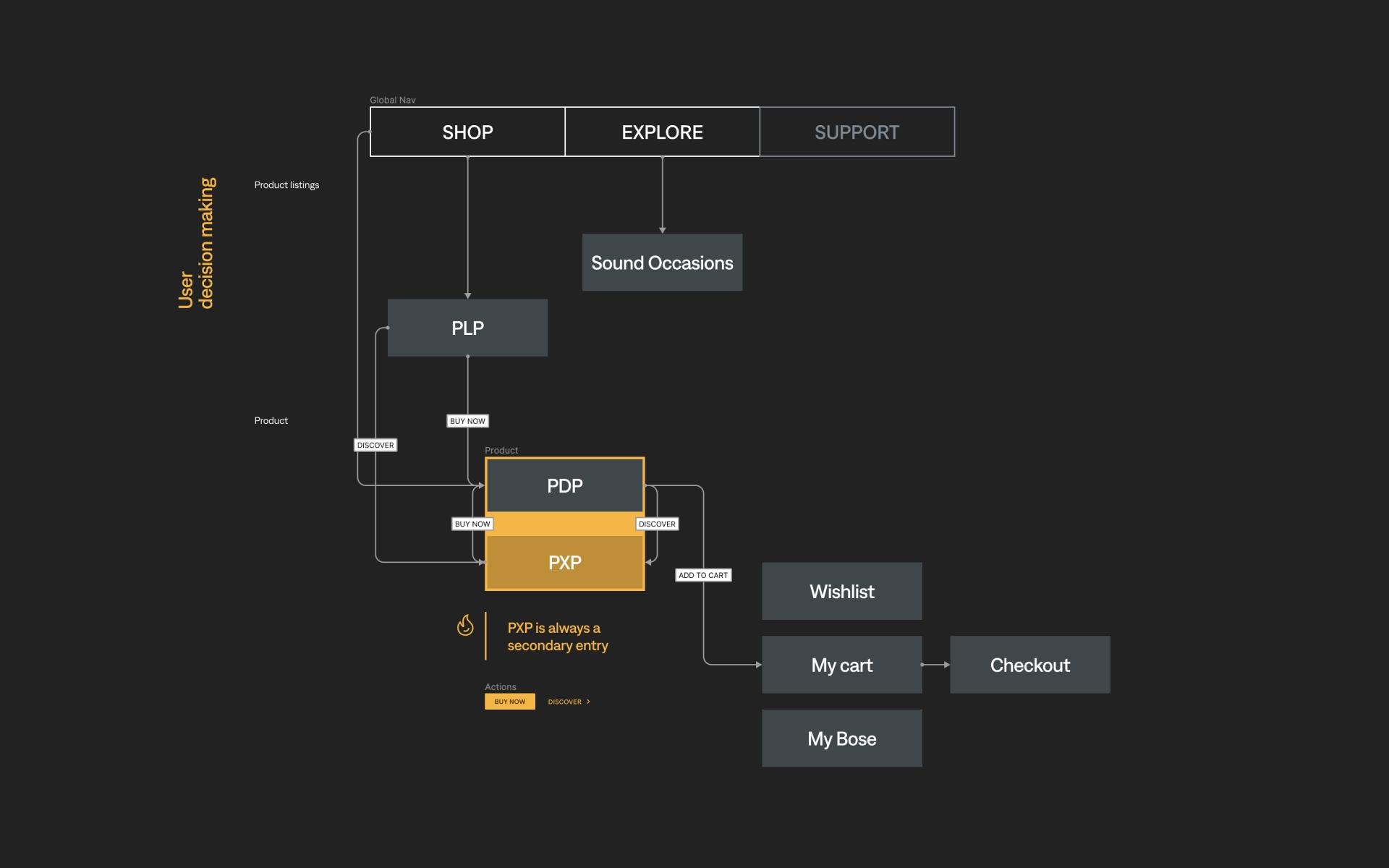
Under this umbrella I led the UX efforts to improve, guide and optimize the 'Explore section on Bose.xx. Under the explore section we have entries to what internally we called ‘Sound Occasions’. Following the positive feedback we've approached the same priciples to improve the product experience pages(PXPs).
Simplified navigational path
Find
SHOP
Direct path to purchase via intuitive groupings.
Explore
EXPLORE
Discover based on listening moments.
HELP
SUPPORT
Best-in-class customer support.

Sound Occasions
Explore
Cross-category groupings
Bridge the digital-physical by allowing customers to 'try' and 'feel' products and discover the ideal product for their sound needs.
user mindset
"I don't know which product will meet my need."
PLP
Find
Category overview
Provides a fast and guided way to identify the ideal product from a diverse range, highlighting their distinct features.
user mindset
"I'm looking for some headphones"
PXPs
Learn
Flagship products
Center the site around a core group of products and provide content that allows customers to immerse themselves, fostering a sense of ownership.
user mindset
"I'm looking for the best noise cancelling headphones."
PDP
Purchase
Product information
Enable quick comprehension to help customers confidently confirm their choices and make purchases.
user mindset
"I need headphones for work, with specific features."
Customer insights
Persona
We serve the music lover
Our design decisions were guided by a persona deeply rooted in the love for music and technological enhancements. This persona, characterized by a strong desire to "feel the music," values quality and immersive sound experiences that allow them to listen critically, relax, and set the mood according to their preferences.
Pain points
A look at user pain points
Addressing the pain points of our target persona revealed several challenges that affect their experience and satisfaction.
- too many options
- too engineered and serious
- not understanding how products fit their life
- difficult to evaluate many options
There is a gap in understanding how different products can seamlessly integrate into their lifestyle, particularly in terms of usability and practicality. This disconnect often leaves them unable to visualize the benefits of a product in their daily music listening and entertainment routines.
User testing learnings
We aimed to assess the effectiveness of the product experience page's storytelling in educating and encouraging potential buyers. Additionally, we sought to understand customer reactions to copy, imagery, and page rhythm to determine if anything is missing from the experience.
The interview was conducted in partnership with an external agency, guided by the UX strategy we developed.
Sound
Occasion
Themed shopping
Uncover customer needs and priorities to identify the Bose product for the sound occasion (activity) that matters to them.Explore
What are Sound Occasions?
Sound occasion pages respond to the "listening moments" strategy, tapping on our learnings about how customers use their products in specific contexts.
Shop by Occasion strategy
These pages allow us to showcase multiple product categories around one use case, explain how uniquely Bose technology delivers better sound, and tell a more engaging story that goes beyond just product.
- Guide users that don’t know much or haven’t yet made up their mind about a specific range of products
- Showcase currated products based on specific use cases around occasions locations and locations
Simply and go
I developed an initial concept to guide our information architecture, serving as our north star. With limited time for research, we leveraged the existing knowledge and relied on our expertise and best judgment.
Goals
- Leverage the explore section to drive more organic traffic
- Surface relevant content to website visitors
- Improve page exploration, discoverability and better connect to other areas of the website
Action items
In order to achieve our goals we’ve covered the following action items
- Defined purpose of SO/PXP Pages to highlight products, integrate categories and drive emotional engagement.
- Audit & optimization of motion to assess animation and transitions, establish motion principles and create modular reusable components.
- Guide development by setting rules and motion guidelines, balanced page elements and improve UX contextually.
Proposed solutions & recommendations for 'explore' pages
Our solution centered on developing a story-driven, actionable, user-centric page that leverages technology enabled by real-life situations to guide users to products.
This approach prioritizes user behavior as the driver of technology, with products playing a supportive role.
Key ingredients
- Focus around one specific occasion/activity.
- Set context by provide familiar locations.
- Use technology benefits to engage users.
- Showcases cross-category groupings based on shared technology.
- Drive for familiarity and consistency.

Highlight
Information Architecture
While staying true to our overarching goal, we proposed the adoption of a formula that not only enhances user exploration but also simplifies maintenance for our internal teams.
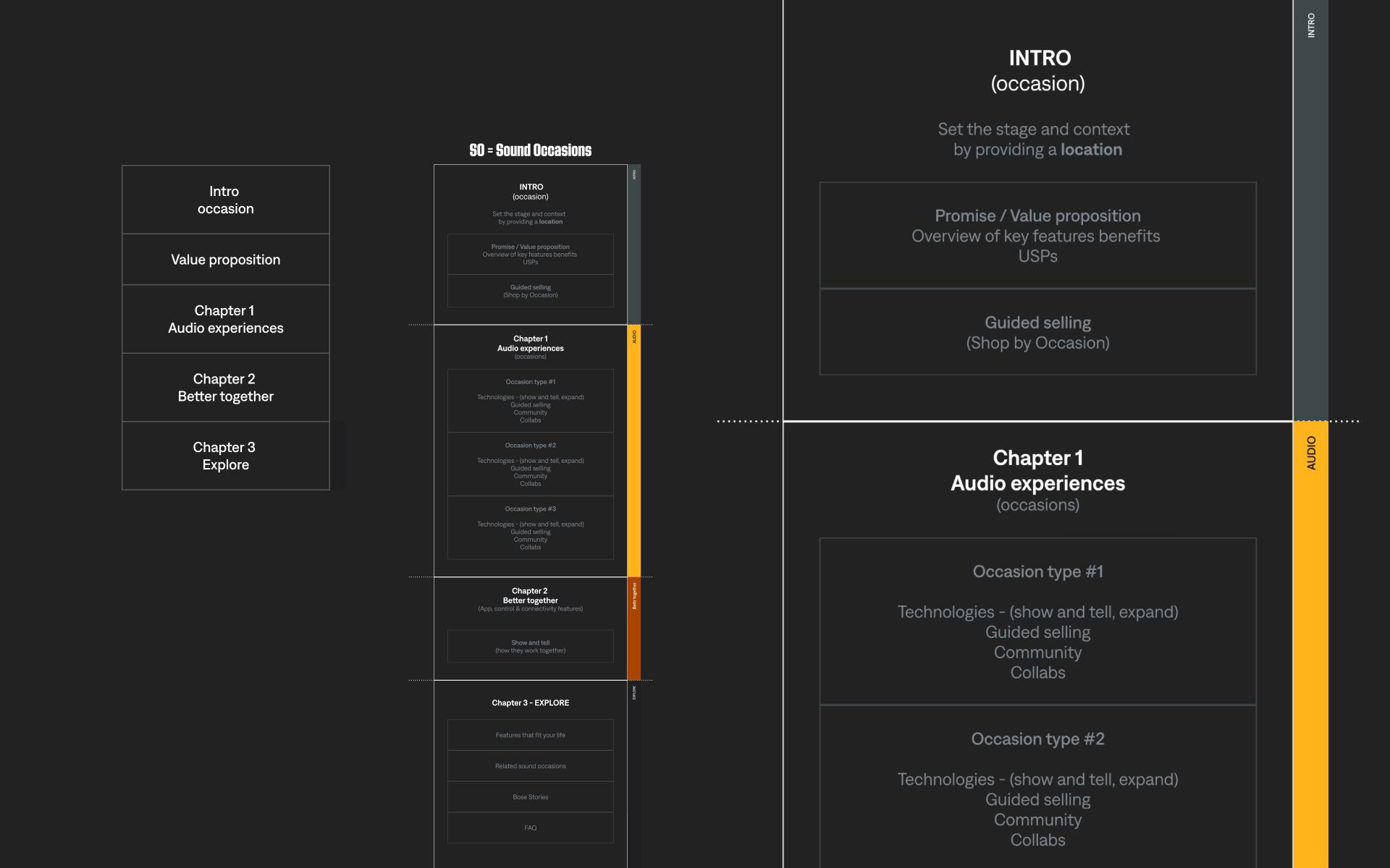
Progressive disclosure
Present information gradually, only as it becomes relevant or necessary for the user.
- reduce cognitive load
- decluttered UI
- user has control
Clear entry points
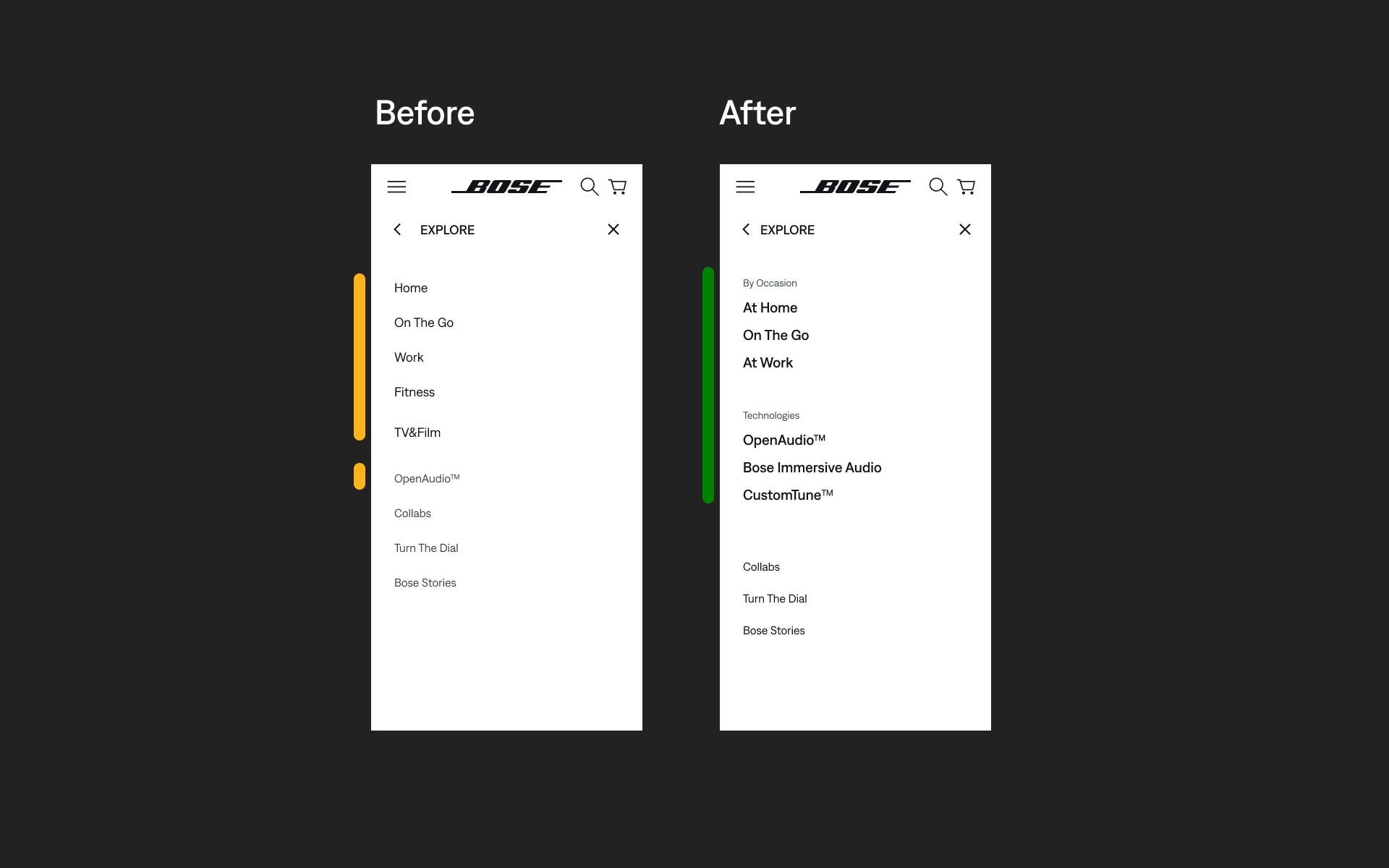
This approach not only caters to diverse customer interests but also aligns with the trend of providing curated and thematic product collections to enhance the overall online shopping journey.
- familiar groupings that resonated to users
- consistent focus on ocassion
Highlight
Proof of concept
Leveraging our information architecture and adhering to our motion principles and guidelines, we aimed to rapidly develop a testing prototype that closely resembles the final product. This self-initiated effort proved successful during discussions with stakeholders, even if it was a work in progress when demoing it.
View prototype **NOTE Only chosen ones have access so be ready for a password.Product
experience
Discover
Get customers closer to sound and educate by letting them feel, try and immerse themselves in the products, while building mental ownership.Learn
What are PXPs?
The PXPs (Product Experience Pages) were developed to address a recognized gap in our website's user experience.
PXP strategy
Why PXPs?
We required a solution to establish hierarchy within our product lineup and effectively convey the story of our flagship products in a more immersive manner. This solution needed to evoke an emotional response and facilitate a "show and tell" experience, enabling users to explore, interact with, and develop an affinity for the product before transitioning into the purchase phase.
Goals
We aimed to address specific UX challenges, focusing on enhancing usability, performance, and emotional engagement across the platform.
- reduce or eliminate animations on components where usability is compromised by excessive motion
- Surface relevant content to website visitors + update content to provide richer context and link imagery with more emotionally resonant copy
- Improve page exploration, discoverability and better connect to other areas of the website
- improve performance and user focus by expanding the use of static components
- refine scroll mechanics and timing adjustments to enhance performance and user experience on both desktop and mobile
- ensure video animations behave consistently across the site, displaying text concurrently with video playback to optimize page load times. Eliminate scroll-triggered and parallax effects.
- reduce unwanted negative space to improve content density and user engagement, without disrupting the overall UI in special use cases.
Highlight
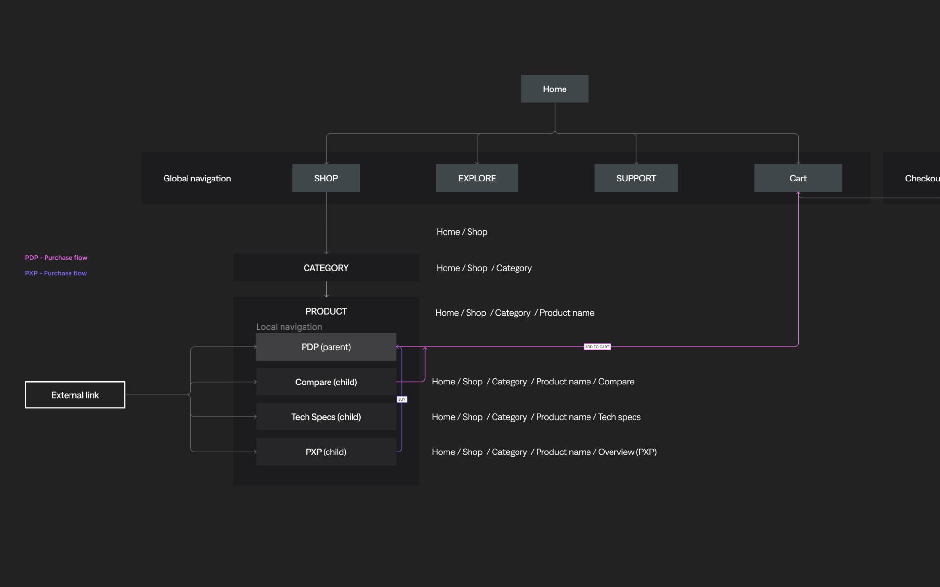
Information Architecture - PXP
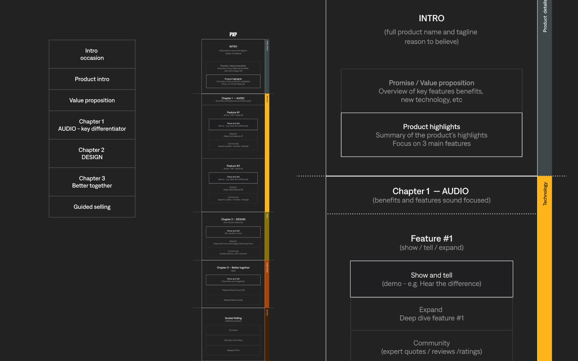
Sound Occasion approach to a formula proved to be succesful thus we approached the same solution for our PXP pages.
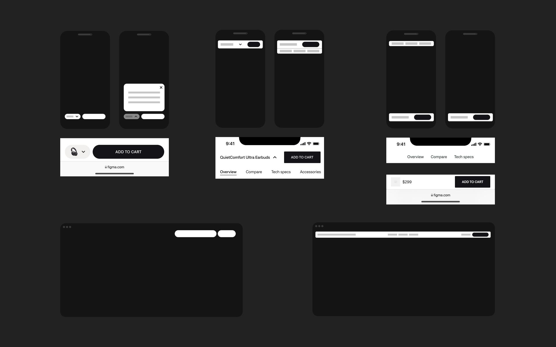
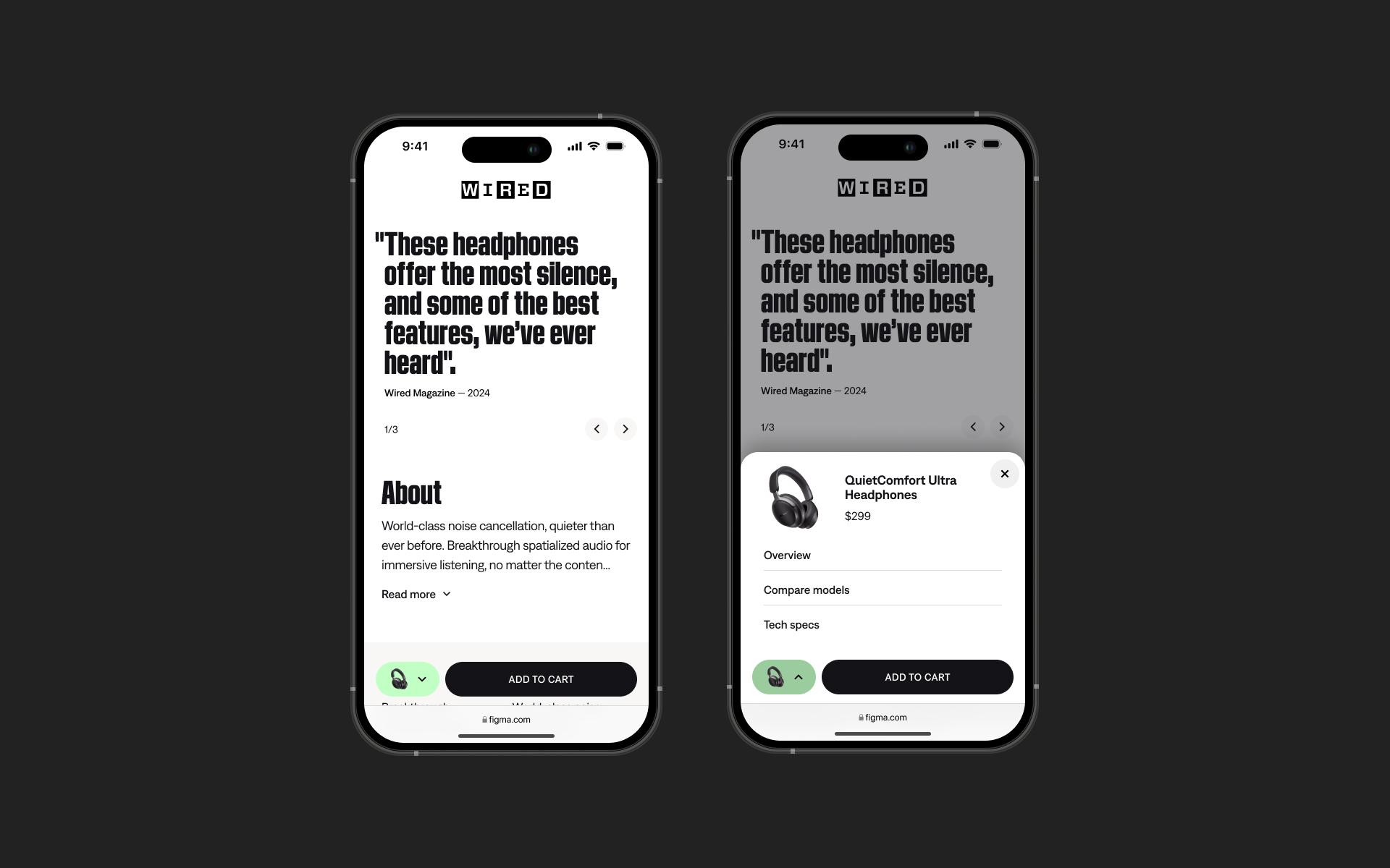
Local navigation
Valuable orientation and wayfinding aid — the local navigation indicates to users where they are and what other content is nearby in an information hierarchy.
Hypothesis
Problem statement
The inability of users to easily access and understand product overviews and distinctions may result in lower engagement and reduced purchasing intent.
Solution
Provide straightforward access to product categories and clear explanations of their relevance and differences to enhance user understanding and engagement.
Highlight
Communicating benefits by adding depth
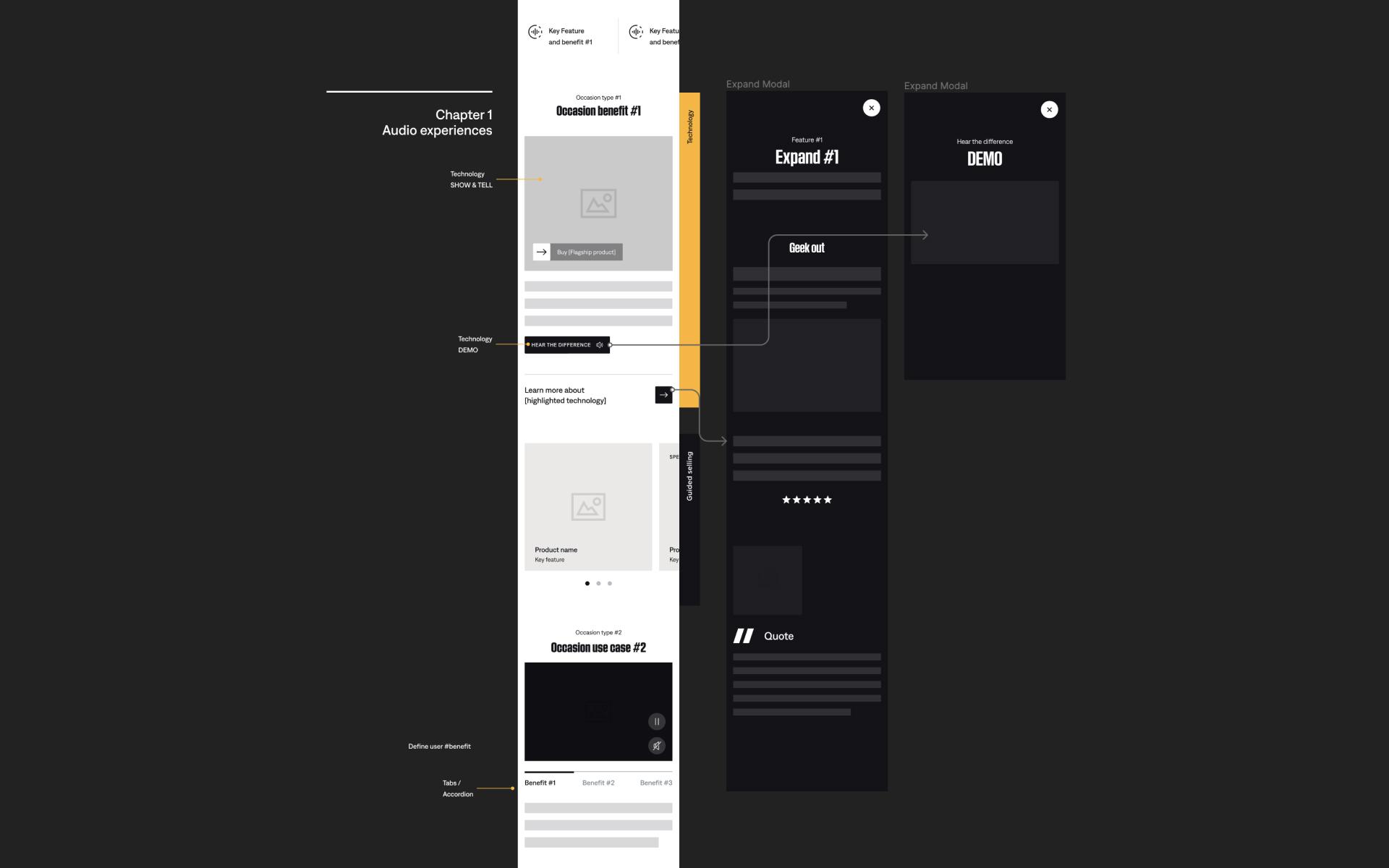
Beyond the page structure we introduced an approach that would facilitate the communication of our product’s benefits. This method showcases layered information, allowing users to explore topics of interest in greater depth at their own pace.
An invitation to discover
Show & tell
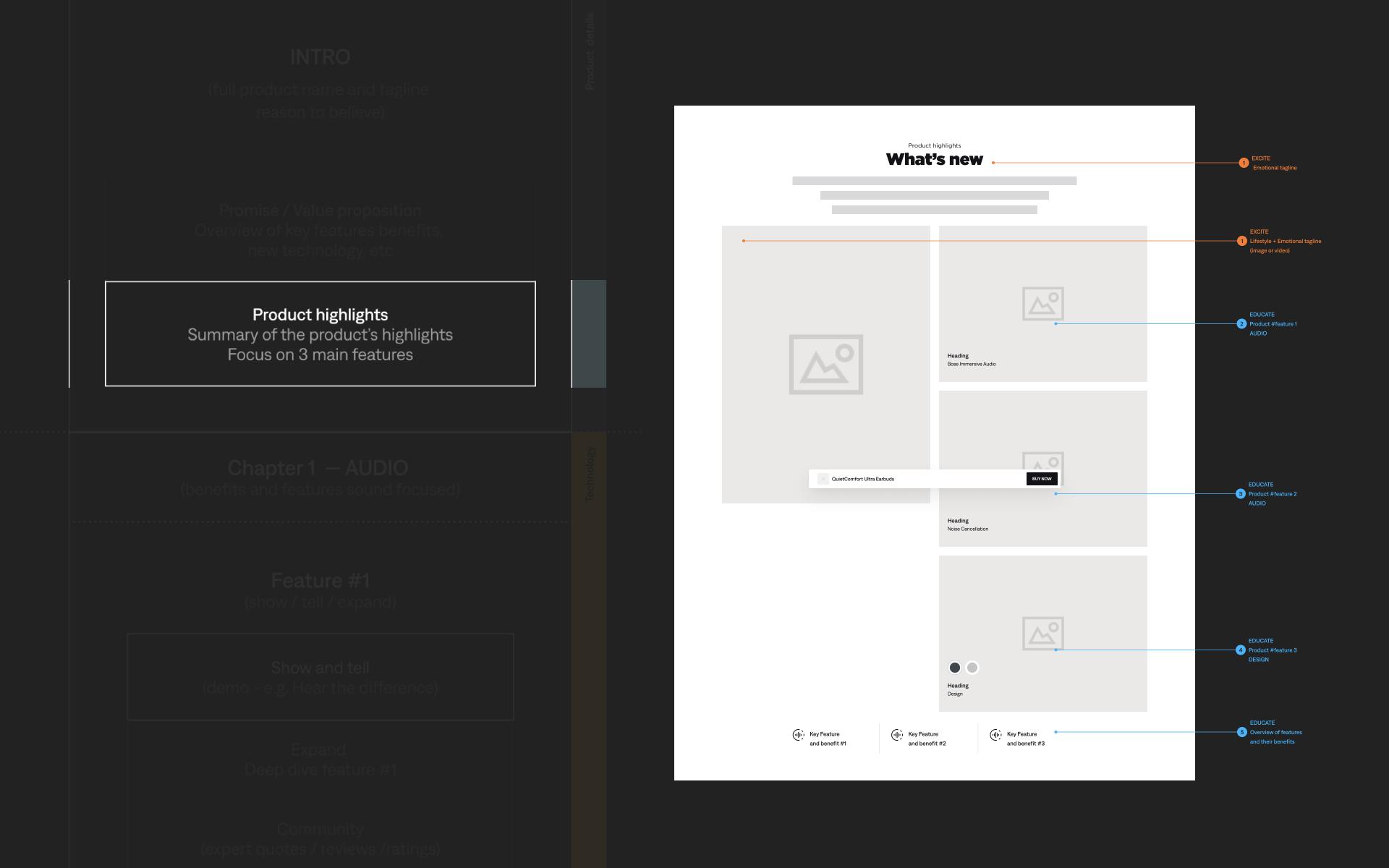
Excite → Present
Learn
Educate → Expand
Build trust
Convince → Emphasize
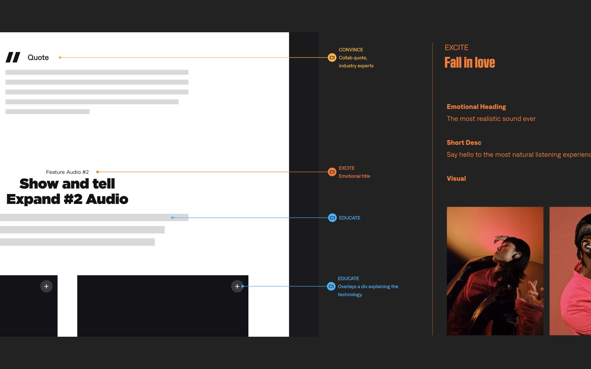
Wireframes were annotated to support the 'Excite, Educate, Convince' strategy, providing clear guidance on each step of the approach.
Highlight
Proof of concept
The prototype highlights the present/expand/emphasize approach. Our objective was to gather directional feedback from users, which will guide us in making further incremental changes.
The prototype is a work-in-progress, with some content still pending, yet it has proven successful as a POV (point of validation) with stakeholders.
The End
Deliverables
- Design System Guidelines & Recommedations
- UX Strategy & Approach
- Information Architecture
- Documentation
- Prototyping — Webflow Explore 'At Home' | PXP 'Ultra Open Earbuds'
Personal Note
In large, global companies, it's crucial to recognize that change occurs incrementally and can be challenging to implement. Celebrating small victories is essential to maintain momentum and encourage ongoing progress.
Out there
View prototypeUX and EyeCandy.
© All rights reserved. Images belong to the brands.